Rapid data visualization with ggplot2
Charles Martin
September 2018
- Clarifications
- Tips to enjoy your time with ggplot2
- Our dataset
- A first plot
- What other visual properties are availble?
- Example
- To modify all points at once
- Exercise #1
- Where ggplot2 really shines
- A bestiary of ggplot graphic layers
- Visualizing error / uncertainty
- The ultimate data exploration tool
- Before you tweak your plots, learn how to properly save them…
- On last thing… the gray background!
Clarifications
Everything you’ll see in this post could also be done with base graphics in R.
The advantage of using ggplot2 is that you’ll spend much less time programming (i.e. doing loops, managing arrays, conditions, etc.) and much more time actually visualising data.
Also, this workshop is not about plot customization. The plots might not be exactly to your liking (e.g. color choice, symbols, etc.). It is only about data exploration.
Tips to enjoy your time with ggplot2
- Make sure you’re analyzing tidy data (e.g. rows are observations, columns are variables),
- Don’t fight it. ggplot2 is not base graphics with fancy names,
- Make sure you understand the structure of a typical ggplot2 command,
- Print the cheat sheet,
- Don’t be afraid to insert like breaks and indentations to clarify your code.
Our dataset
library(ggplot2)
data(msleep)
summary(msleep)
     name              genus               vore
 Length:83          Length:83          Length:83
 Class :character   Class :character   Class :character
 Mode  :character   Mode  :character   Mode  :character


    order           conservation        sleep_total      sleep_rem
 Length:83          Length:83          Min.   : 1.90   Min.   :0.100
 Class :character   Class :character   1st Qu.: 7.85   1st Qu.:0.900
 Mode  :character   Mode  :character   Median :10.10   Median :1.500
                                       Mean   :10.43   Mean   :1.875
                                       3rd Qu.:13.75   3rd Qu.:2.400
                                       Max.   :19.90   Max.   :6.600
                                                       NA's   :22
  sleep_cycle         awake          brainwt            bodywt
 Min.   :0.1167   Min.   : 4.10   Min.   :0.00014   Min.   :   0.005
 1st Qu.:0.1833   1st Qu.:10.25   1st Qu.:0.00290   1st Qu.:   0.174
 Median :0.3333   Median :13.90   Median :0.01240   Median :   1.670
 Mean   :0.4396   Mean   :13.57   Mean   :0.28158   Mean   : 166.136
 3rd Qu.:0.5792   3rd Qu.:16.15   3rd Qu.:0.12550   3rd Qu.:  41.750
 Max.   :1.5000   Max.   :22.10   Max.   :5.71200   Max.   :6654.000
 NA's   :51                       NA's   :27
83 observations about mammal sleep habits.
- Sleep measurements (in hours):
sleep_totalsleep_remsleep_cycleawake
- And other animal body measurements (in kg):
brainwtbodywt
A first plot
ggplot(data = msleep) +
  geom_point(mapping = aes(x = sleep_rem, y = awake))
Warning: Removed 22 rows containing missing values (geom_point).
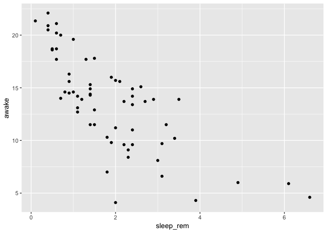
ggplot: creates a graphic objet, and associates it with the given dataset.
Graphic layers are then added upon it.
mapping: created links between variables in the dataset and visual properties from the plot
N.B. ggplot warns us that some rows were removed because they contained missing values for either sleep_rem or awake. We’ll see how to filter them in a future workshop.
What other visual properties are availble?
Among others…
colorsizealpha(transparency, 0-1)shape(max 6)
To view all visual properties for a graphic layer, look for the Aesthetics section in the layer’s help page (?geom_point)
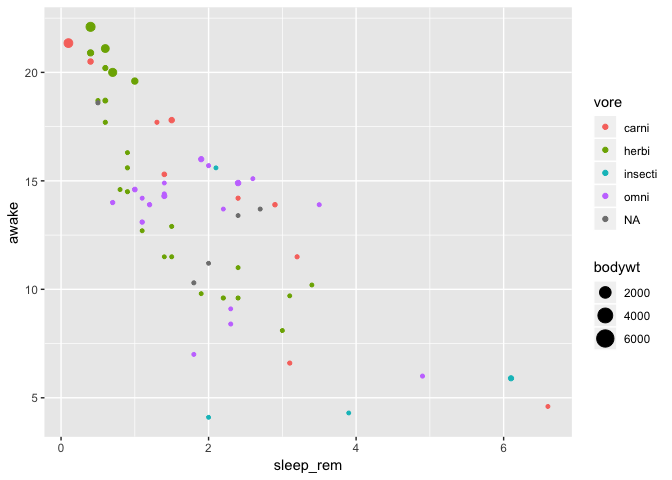
Example
We improve the above graphic by adding a color representing the feeding type (vore) and by
linking the point size to the animal body size (bodywt)
ggplot(data = msleep) +
  geom_point(mapping = aes(
    x = sleep_rem,
    y = awake,
    color = vore,
    size = bodywt
  )
)
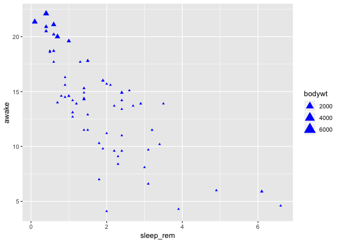
To modify all points at once
To change some graphic properties of all points at once (instead of associating them with values from their respective observations), one needs to specify the association outside of the aes block:
ggplot(data = msleep) +
  geom_point(
    mapping = aes(
      x = sleep_rem,
      y = awake,
      size = bodywt
    ),
    color = "blue",
    shape = 17
)
Exercise #1
Create a plot of mammal brain size (brainwt) in relationship with the animal size (bodywt)
Replace points with squares
The color of every square must show the conservation status of the species (conservation)
Where ggplot2 really shines
Let’s say you want to explore the relationship between the time spent awake by each species and the REM sleep duration…
ggplot(data = msleep) +
  geom_point(mapping = aes(
    x = sleep_rem,
    y = awake
  )
)

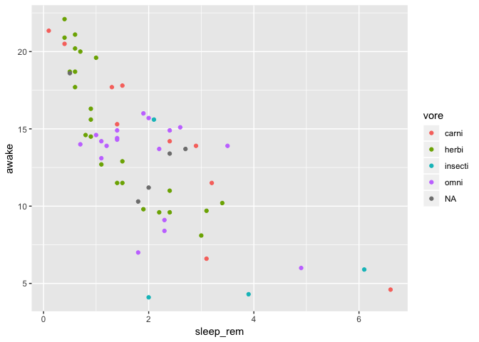
This looks interesting, but you are interested to know if the sleep habits vary in the same way between feeding types. So, you add color to explore that.
ggplot(data = msleep) +
  geom_point(mapping = aes(
    x = sleep_rem,
    y = awake,
    color = vore
  )
)
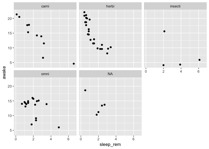
Right at this moment, a co-worker sees the plot above your shoulder, and suggests you to place each feeding type in it’s own panel to clarify things up.
No problem, a single line of ggplot2 does the trick:
ggplot(data = msleep) +
  geom_point(mapping = aes(
    x = sleep_rem,
    y = awake
  )) +
  facet_wrap(~vore)
Ok, no, your previous plot was better, but can you add a smoothing curve per feeding type to see if the trend is the same?
No problem, it’s no biggie to remove you panels, just remove that single ggplot2 command. Then you add a smoothing layer above your points:
ggplot(data = msleep) +
  geom_point(mapping = aes(
    x = sleep_rem,
    y = awake,
    color = vore
  )) +
  geom_smooth(mapping = aes(
    x = sleep_rem,
    y = awake,
    color = vore
  )
  )
`geom_smooth()` using method = 'loess' and formula 'y ~ x'
N.B. Here you’ll have many warnings because our dataset is way too small to calculate smoothing curves correctly for each feeding type. It’s only a toy example.
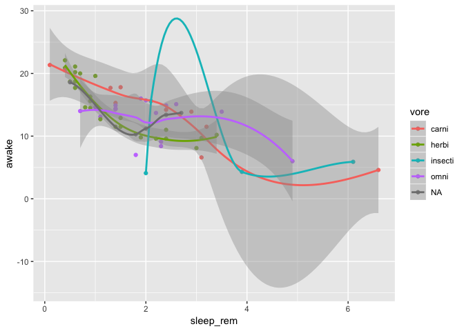
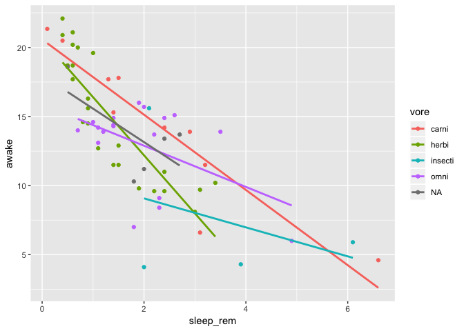
Well, that is clearly unreadble right? Can you just put linear regressions in there instead?
Yep, no problem, just edit your smoothing layer to use to lm function. You also
strategically remove the standard error bands because they are all stacked up one above the other…
ggplot(data = msleep) +
  geom_point(mapping = aes(
    x = sleep_rem,
    y = awake,
    color = vore
  )) +
  geom_smooth(
    mapping = aes(
      x = sleep_rem,
      y = awake,
      color = vore
    ),
    method = "lm",
    se = FALSE
  )
To remove code duplication, use global mappings
If you need to reuse the same graphic property-dataset variable associations in
many layers as we did above, you can put all your common associations inside the
initial ggplot call:
ggplot(data = msleep, mapping = aes(
    x = sleep_rem,
    y = awake,
    color = vore
  )) +
  geom_point() +
  geom_smooth(
    method = "lm",
    se = FALSE
  )
To densify your code even more
You can take advantage of the fact that in R, the name of the arguments given to
a function is optional, as long as you keep your arguments in the same order as
specified in the help file (?ggplot):
Usage
ggplot(data = NULL, mapping = aes(), ..., environment = parent.frame())
Which allows you to do:
ggplot(msleep, aes(
    x = sleep_rem,
    y = awake,
    color = vore
  )) +
  geom_point() +
  geom_smooth(
    method = "lm",
    se = FALSE
  )
A bestiary of ggplot graphic layers
Visualizing a single continuous variable
ggplot(msleep) +
  geom_histogram(aes(x = awake))
`stat_bin()` using `bins = 30`. Pick better value with `binwidth`.
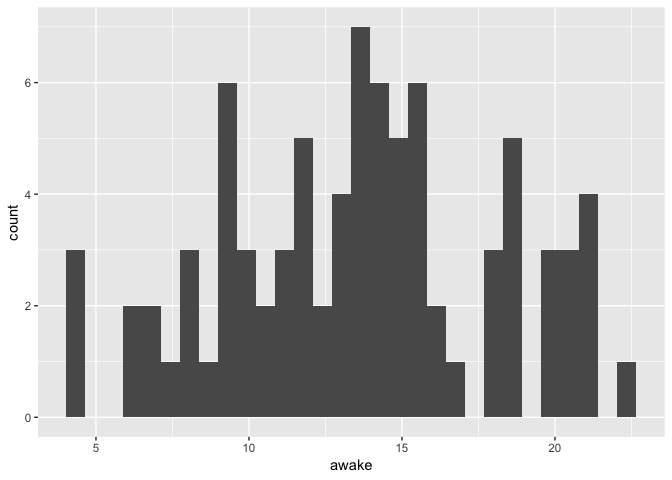 Notice the warning about the number of bins used. In contrary to the base graphics
hist function, histograms in ggplot don’t use algorithms to determine the ideal
number of bins. It is your job to try different values to determine what fits
your particular case.
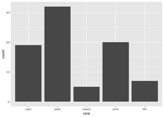
Visualizing a categorical / discrete variable
ggplot(msleep) +
  geom_bar(aes(x = vore))
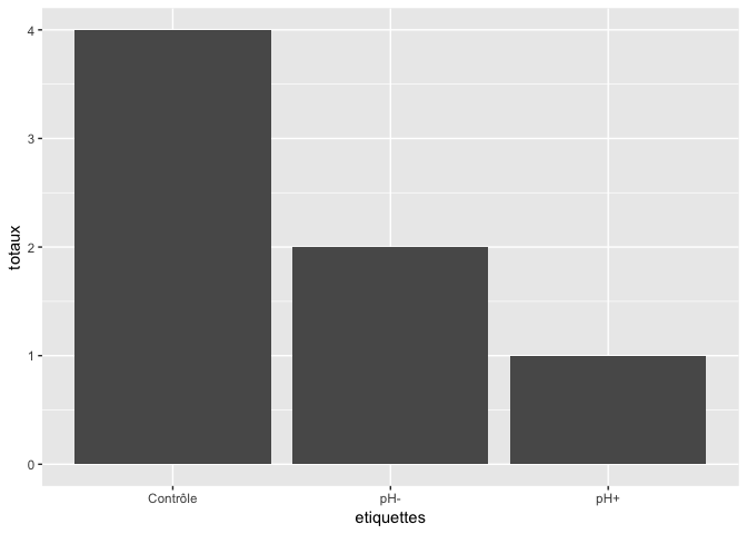
Note that, if your totals are already calculated, you need to use an alternate geom:
sums <- data.frame(
  total = c(4,1,2),
  labels = c("Control", "pH+", "pH-")
)
ggplot(sums) +
  geom_col(aes(x = labels, y = total))
Visualizing the relationship between two continous variables
ggplot(msleep) +
  geom_point(aes(x = sleep_rem, y = awake))

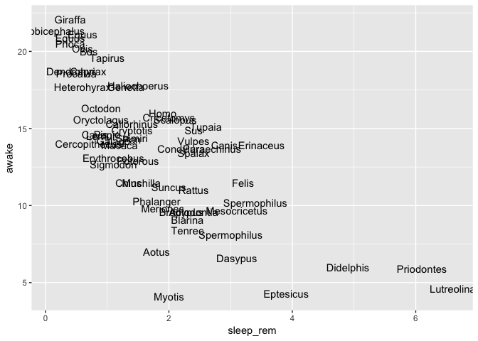
You can also replace points with text
ggplot(msleep) +
  geom_text(aes(x = sleep_rem, y = awake, label = genus))
Visualizing the relationship between a continuous and a categorical variable
ggplot(msleep) +
  geom_boxplot(aes(x = vore, y = awake))
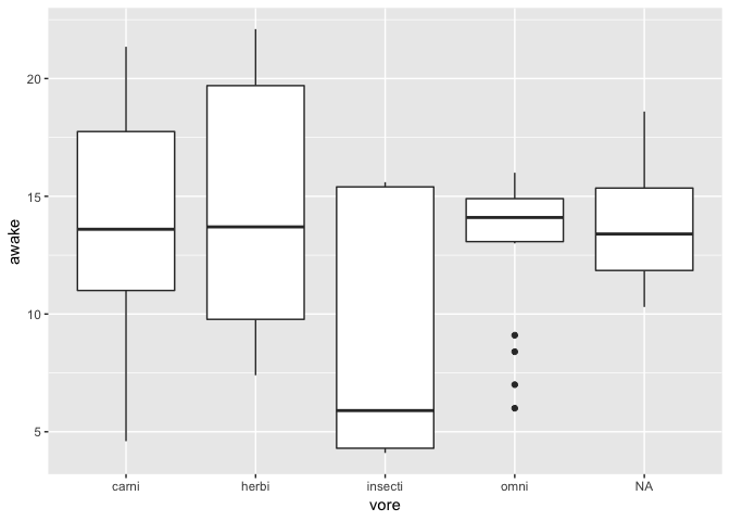
Note that a boxplot only expresses data about 5 of your data points (median, 1st quartile, 3rd quartile and biggest data within 1.5 IQR).
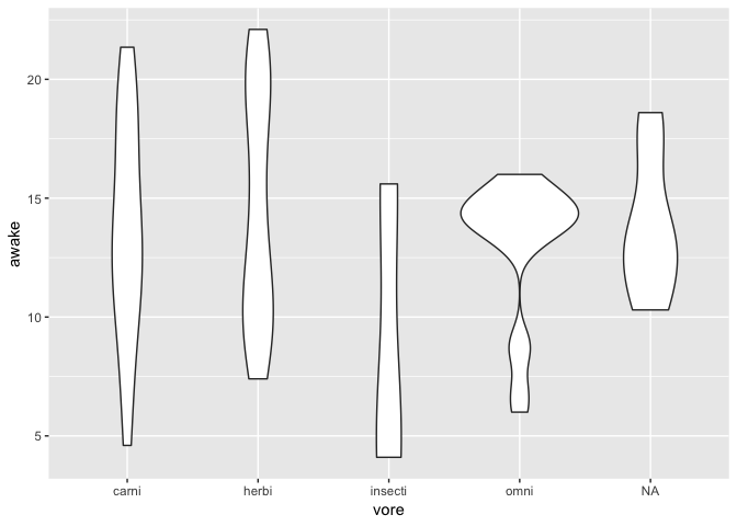
A more informative view about the whole distribution can be obtained with a violin plot
ggplot(msleep) +
  geom_violin(
    aes(x = vore, y = awake)
  )
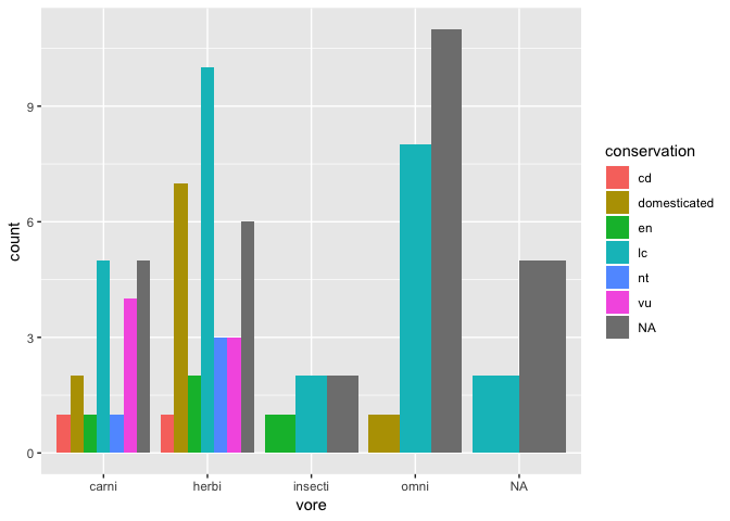
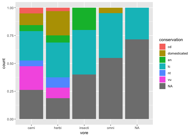
Visualizing the relationship between two categorical variables
ggplot(msleep) +
  geom_bar(aes(x = vore, fill = conservation))
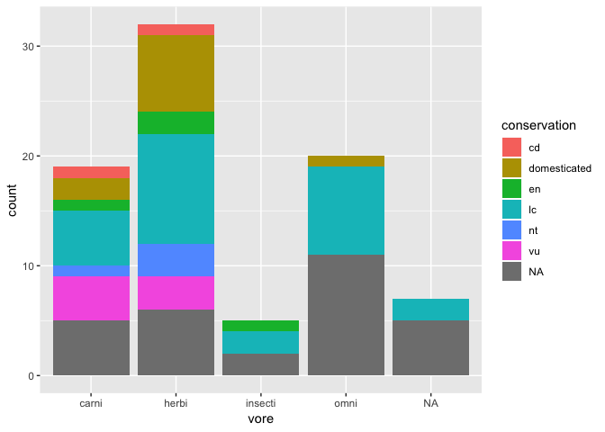
Position modifiers
You can use position modifiers to organize this bar plot in alternate ways:
ggplot(msleep) +
  geom_bar(
    aes(x = vore, fill = conservation),
    position = "dodge"
  )
ggplot(msleep) +
  geom_bar(
    aes(x = vore, fill = conservation),
    position = "fill"
  )
Visualizing error / uncertainty
For this section, we’ll need an additional dataset, where we have observed values in x, predicted values in y, and the standard error of these predicted values.
df <- data.frame(
  x = c(1,2,3,4),
  y = c(1.1,1.9,3.4,4),
  se = c(0.4, 0.5, 0.7, 0.5)
)

ggplot(df, aes(x = x, y = y)) +
  geom_point() +
  geom_errorbar(
    aes(ymin = y - se, ymax = y + se),
    width = 0.3
  )
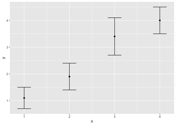
You’ll notice that we need to manually construct the size of the error bar, using
the information we have about the predicted values and their error. We could
as well use 1.96 * se, etc.
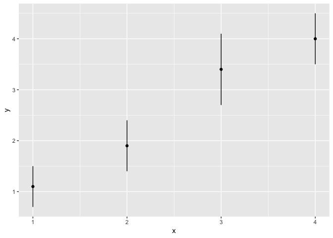
ggplot(df, aes(x = x, y = y)) +
  geom_point() +
  geom_linerange(
    aes(ymin = y - se, ymax = y + se)
  )
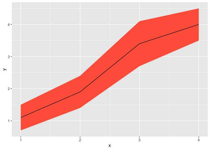
ggplot(df, aes(x = x, y = y)) +
  geom_ribbon(
    aes(ymin = y - se, ymax = y + se),
    fill = "tomato"
  ) +
  geom_line()
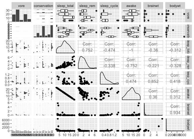
The ultimate data exploration tool
If you want to explore all variables and relationships in a dataset at once,
the ggpairs function from the GGally package does just that.
Note that you need to filter out columns/variables that are not numerical or categorical (i.e. species or site names, etc.)
library(GGally)
ggpairs(msleep[,-c(1,2,4)])
ggpairs(msleep[,-c(1,2,4)], aes(col = vore))
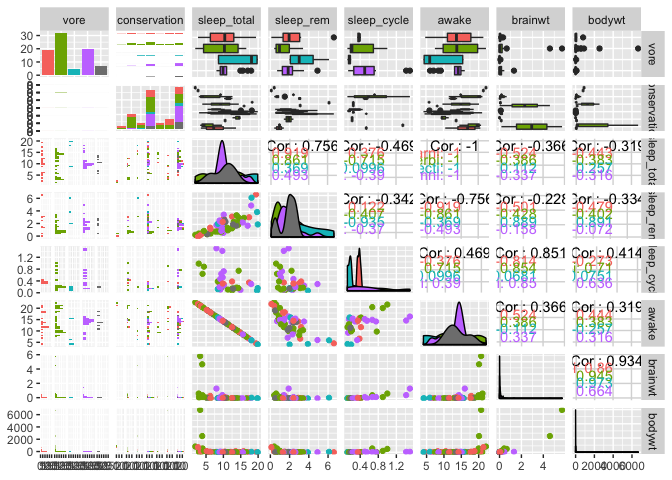
NB Please be patient with ggpairs, it might need a minute or two to compute your plot, as it is effectively doing tens or even sometimes hundred of plots depending on the number of variables
Before you tweak your plots, learn how to properly save them…
First of all, use the proper ggplot function (ggsave) to save your plots. It
offers much more control over the quality and features of the ouput than the
Export feature in RStudio or related functionalities.
The ggsave function sends the last plot to a file, with the correct format based
on the file extension given (e.g. gif, png, jpg, pdf, eps)
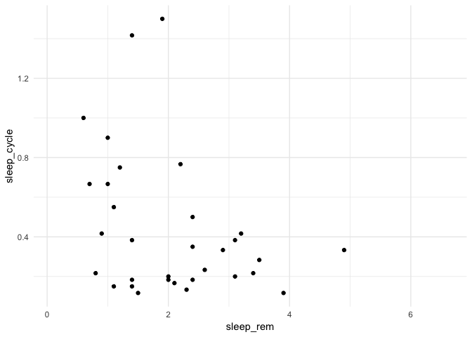
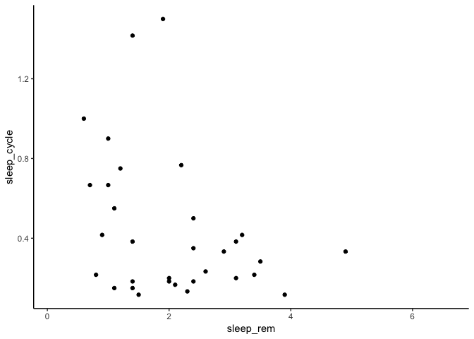
ggplot(msleep) +
  geom_point(aes(x = sleep_rem, y = sleep_cycle))
ggsave(filename = "Resultats/Fig1.jpg")
Saving 7 x 5 in image
Note that to save your files in a folder, ggsave insists that you manually
create the folder first.
Which dimensions should I use?
There is no easy answer here. It is a trial and error process. ggplot changes the relative size
of points, text, lines, etc. based on the given dimensions. You’ll need to experiment.
Here, for example, the same plot is saved in a 2x2 file and and 8x8 file
ggsave(filename = "Resultats/2x2.jpg", width = 2, height = 2)
ggsave(filename = "Resultats/8x8.jpg", width = 8, height = 8)

Default units are inches, but you can change them to cm with the
units="cm" argument
How to change the file resolution
For pixel-based files (e.g. jpg, png, gif), you can also specify image quality, in number of pixels per inches (dot per inches; dpi)
For example, the same 2x2 plot can be extremely pixelized or ultra-sharp depending or the resolution selected:
ggsave(filename = "Resultats/72.jpg", width = 2, height = 2, dpi = 72)
ggsave(filename = "Resultats/1200.jpg", width = 2, height = 2, dpi = 1200)

For printed publications, a minimum of 300 dpi is usually recommended.
On last thing… the gray background!
One of the most controversial aspects of ggplot is the use of a gray background with white grid lines. For a rapid overview of the reasons Hadley Wickham used such a color scheme, you can read a free excerpt of its excellent R for Data Science book (from which the flow of this workshop was heavily borrowed)
Nonetheless, you can easily change the theme of a ggplot by adding a theme layer.
ggplot(msleep) +
  geom_point(aes(x = sleep_rem, y = sleep_cycle)) +
  theme_classic()
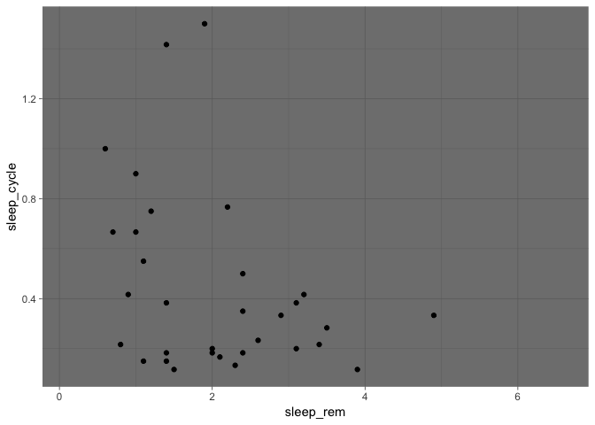
ggplot(msleep) +
  geom_point(aes(x = sleep_rem, y = sleep_cycle)) +
  theme_dark()
And my personnal favorite, the minimal theme:
ggplot(msleep) +
  geom_point(aes(x = sleep_rem, y = sleep_cycle)) +
  theme_minimal()