Advanced ggplot2 - Solutions to everyday problems
Charles Martin, edited by Jade Dormoy-Boulanger
January 2024
- Highlighting information
- Classic issues in limnology
- Issues in plant ecology
- Customizing
- Publication-ready figures
- Miscellaenous
This workshop assumes that you are already familiar with basic ggplot2 functions. If this isn’t the case, please take a couple of minutes to skim through our introduction to ggplot2 at https://numerilab.io/en/workshops/RapidDataViz before proceeding with this workshop.
This workshop is structured in a problems and solutions kind of way. I tried to collect all of the commons issues ggplot2 users have come to my desk with in the past couple of years. I then tried to organize these problems by theme, but this workshop is still a mixed collection of unrelated issues.
Highlighting information
Annotations
One thing you might often want to do with a ggplot is to add a tiny bit of information
that doesn’t come from your main data frame. You could, of course, cheat a little
and add this information to your main data frame, with some special coding to know
it is an annotation. Recent versions of ggplot2 now offers a function called annotate
which serves exactly this purpose, in a much cleaner way.
library(ggplot2)

ggplot(msleep, aes(x = sleep_total, y = sleep_rem)) +
  geom_point() +
  annotate("point", x = 15, y = 6, color = "red", size = 3) +
  annotate("text", x = 15.5, y = 5.6, label = "Strange critter")
Warning: Removed 22 rows containing missing values (`geom_point()`).
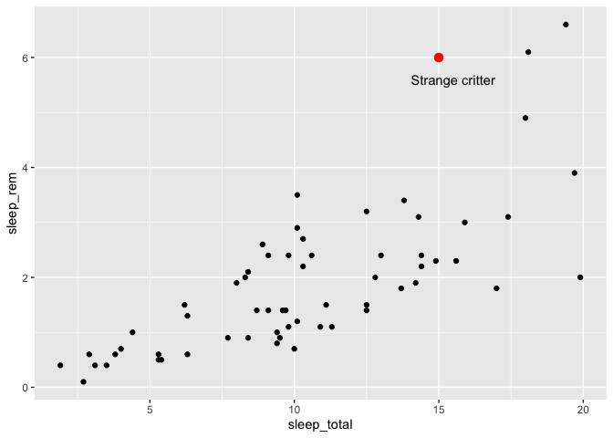
As you can guess from this example, the first argument of the annotate function is the name of the geom you would have like to use. “point” for geom_point, “text” for geom_text, etc. You can then give values for any of the geom attributes you would have liked, without the need to put them in a data frame or wrap them with an aes call.
Combining many data sources in a single plot
Before you start building tens of annotations to add to your ggplot, you might find it interesting to know that you can also tell ggplot2 to use an alternate data frame for some geoms instead of your main one.
You could, for example, prepare a data frame with averages per vore from the msleep data set :
library(dplyr)
Attaching package: 'dplyr'
The following objects are masked from 'package:stats':

    filter, lag
The following objects are masked from 'package:base':

    intersect, setdiff, setequal, union
moyennes <- msleep %>%
  group_by(vore) %>%
  summarize(
    sleep_total = mean(sleep_total, na.rm = TRUE),
    sleep_rem = mean(sleep_rem, na.rm = TRUE)
  )
moyennes
# A tibble: 5 × 3
  vore    sleep_total sleep_rem
  <chr>         <dbl>     <dbl>
1 carni         10.4       2.29
2 herbi          9.51      1.37
3 insecti       14.9       3.52
4 omni          10.9       1.96
5 <NA>          10.2       1.88
And then, you can specify that one (or many) of your layers will use that specific data frame instead of the main one, like this :
ggplot(msleep, aes(x = sleep_total, y = sleep_rem, color = vore)) +
  geom_point() +
  geom_point(data = moyennes, size = 5)
Warning: Removed 22 rows containing missing values (`geom_point()`).
To make your life easier, it is a good idea to have identical column names in both data.frames. But nevertheless, you can also re-map your new columns with an aes() call if you decide to have different names.
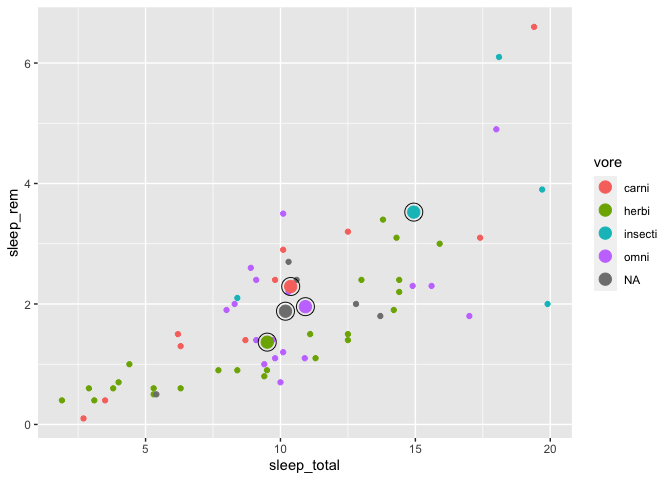
One neat little trick to highlight some data points in a plot is to surround them with an additional line, by adding an empty circle around each point, like this :
ggplot(msleep, aes(x = sleep_total, y = sleep_rem, color = vore)) +
  geom_point() +
  geom_point(data = moyennes, size = 4) +
  geom_point(data = moyennes, size = 6, shape = 1, color = "black")
Warning: Removed 22 rows containing missing values (`geom_point()`).
Classic issues in limnology
Playing with axes
Limnologists often produce plots where many variables (e.g. pH, water temperature, etc.) are displayed on a single plot, with a common depth axis. In theory, it should be pretty simple to do, but in ggplot2, it’s not that simple.
The reason why it’s not so simple is that ggplot2’s author Hadley Wickham firmly believes that these kind of plots can be easily abused to mislead a reader and should not be taken lightly (e.g. https://stackoverflow.com/questions/3099219/ggplot-with-2-y-axes-on-each-side-and-different-scales/3101876#3101876). But don’t dispair, I’ll walk you through the step which, once understood correctly, aren’t that bad.
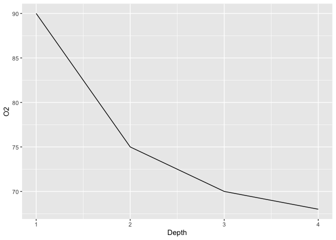
So first, we’ll build ourselves a little limnology data frame, and use it to plot our first variable :
limno <- data.frame(
  Depth = c(1,2,3,4),
  O2 = c(90, 75, 70,68),
  Temperature = c(12.1,10.8,10.4,8.5)
)
ggplot(limno, aes(x = Depth)) +
  geom_line(aes(y = O2))
The first step towards displaying a secondary Y axis is to add that second variable to our plot. Note that for clarity reasons, I also pick different colors and linetypes for each variables :
ggplot(limno, aes(x = Depth)) +
  geom_line(aes(y = O2), color = "blue", linetype = "dashed") +
  geom_line(aes(y = Temperature), color = "red")
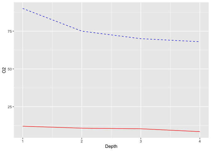
So now both data series are displayed, but they are one the same Y-scale. Our plot needs to know how to scale our second line.
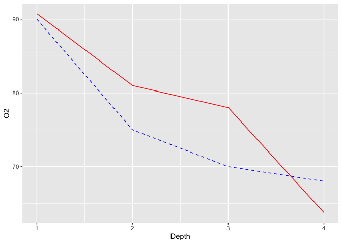
The next step is to think about which data transformation you would need to apply to your Temperature variable to make its upper value equal to the Oxygen value. If both variables are positive, an easy way to do that is to calculate the ratio between the two maximums (90/12=7.5). If you multiply our Temperature values by 7.5, both maximums should happily coincide :
ggplot(limno, aes(x = Depth)) +
  geom_line(aes(y = O2), color = "blue", linetype = "dashed") +
  geom_line(aes(y = Temperature*7.5), color = "red")
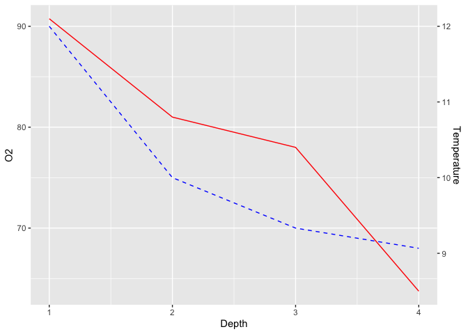
The last step of this process is to add the secondary Y-axis, and specifying to ggplot2 the inverse transform of what we did before, to get our original values back :
ggplot(limno, aes(x = Depth)) +
geom_line(aes(y = O2), color = "blue", linetype = "dashed") +
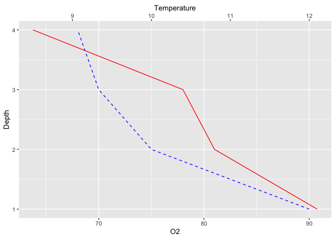
geom_line(aes(y = Temperature*7.5), color = "red") +
scale_y_continuous(sec.axis = sec_axis(~./7.5,name = "Temperature"))
Although water depth is the driving variable for both pH and Temperature and thus
should be on the X axis, these kind of plots are often flipped around to have
water depth on the Y axis, to mimic the spatial structure of a lake. You can easily
do this without changing all your x and y assignations by adding the coord_flip
function to your plot :
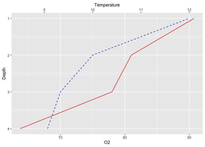
ggplot(limno, aes(x = Depth)) +
  geom_line(aes(y = O2), color = "blue", linetype = "dashed") +
  geom_line(aes(y = Temperature*7.5), color = "red") +
  scale_y_continuous(sec.axis = sec_axis(~./7.5,name = "Temperature")) +
  coord_flip()
To make it even more natural, you could also wish to reverse the X axis (now displayed as Y) so that the water surface (depth=0) is actually at the top :
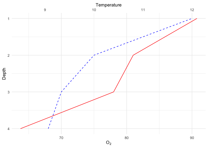
ggplot(limno, aes(x = Depth)) +
  geom_line(aes(y = O2), color = "blue", linetype = "dashed") +
  geom_line(aes(y = Temperature*7.5), color = "red") +
  scale_y_continuous(sec.axis = sec_axis(~./7.5,name = "Temperature")) +
  coord_flip() +
  scale_x_reverse()
Expressions
The last nagging little thing about the previous plot is that the number of atoms in
the oxygen molecule should be in subscript form. To achieve this, you can use R’s
Latex-like purpose-built formula language called plotmath, which is used through the expression function.
While we’re finalizing this plot, I also changed the theme to make a nice publication-ready figure :
ggplot(limno, aes(x = Depth)) +
  geom_line(aes(y = O2), color = "blue", linetype = "dashed") +
  geom_line(aes(y = Temperature*7.5), color = "red") +
  scale_y_continuous(sec.axis = sec_axis(~./7.5,name = "Temperature")) +
  coord_flip() +
  scale_x_reverse() +
  labs(y = expression(O[2])) +
  theme_minimal()
plotmath’s syntax is entirely described on this help page : https://stat.ethz.ch/R-manual/R-devel/library/grDevices/html/plotmath.html
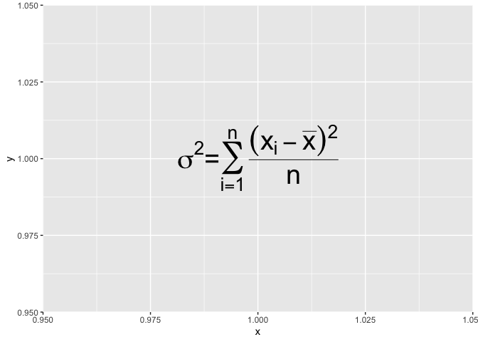
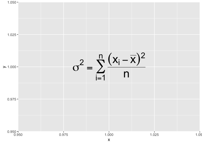
For example, if you wished to write the variance formula in a plot, following the guide should get you something like this :
ggplot() +
annotate("text", x = 1, y = 1, size = 10,label=expression(
  sigma^2 = sum(
    over(
      (x[i]-bar(x))^2,
      n
    ),
    i==1,
    n)
))
Error: <text>:3:11: unexpected '='
2: annotate("text", x = 1, y = 1, size = 10,label=expression(
3:   sigma^2 =
             ^
… except that it doesn’t work!
Beside the syntax, there is additional constraint : the code used to build the expression must be valid R code. In our case, we wrote sigma^2= ... which would not be valid in R. You can never write something like x^2=3 in R.
If you ever need to write invalid code in a expression, know that you can cheat a little and assemble together little valid pieces with the paste function :
ggplot() +
  annotate("text", x = 1, y = 1, size = 10,label=
             expression(paste(
                sigma^2,
                "=",
                sum(over((x[i]-bar(x))^2,n),i==1,n)
            ))
  )
Warning in is.na(x): is.na() applied to non-(list or vector) of type
'expression'
Now that I’ve shown you how to get around the valid-syntax constraint, I need to tell you a
little trick : the syntax guide stipulates that for equalities, one should use == instead
of =, like this :
msleep %>%
  ggplot() +
  annotate("text",x=1,y=1,size = 10,label=
             expression(paste(
                sigma^2 == sum(over((x[i]-bar(x))^2,n),i==1,n)
            ))
  )
Warning in is.na(x): is.na() applied to non-(list or vector) of type
'expression'
Issues in plant ecology
Regression line
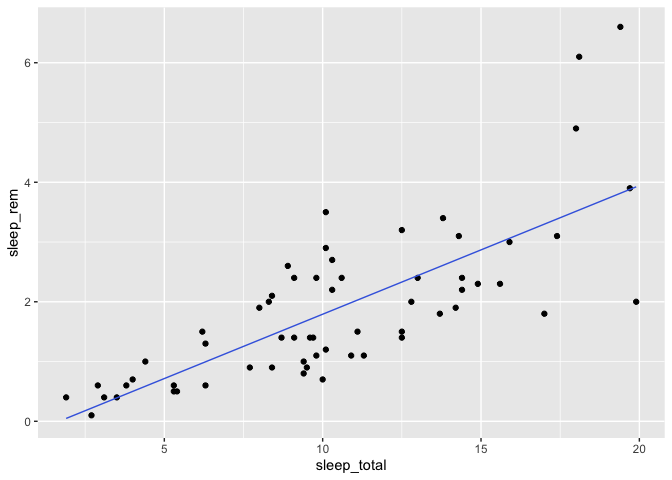
Another case where we might need to add annotations to a plot is when we need to trace a regression line.
First thing to know is that, there is no easy way to do this with geom_smooth(method=”lm”). That function is built to rapidly explore your data but it is not a modeling tool. There is no simple way to extract regression parameters from there. The method I’m showing you here is a bit more involved, but should work with any type of models.
The main idea is to fit a statistical model to your data, and then add model predictions to the original data frame to help plot them (because, keep in mind, everything with ggplot2 is much simpler when your data is correctly organized in a data frame).
Notice that this time, we need to clean up our data frame first, because otherwise, we might have some mismatched rows between our original data frame and the predictions from our model.
library(tidyr)

bd <- msleep %>%
  select(sleep_total, sleep_rem) %>%
  drop_na

m <- lm(sleep_rem ~ sleep_total, data = bd)

bd <- bd %>%
  mutate(
    prediction = predict(m)
  )

bd %>%
  ggplot(aes(x = sleep_total, y = sleep_rem)) +
  geom_point() +
  geom_line(aes(y = prediction), color = "royalblue")
Now, to add the regression equation, we first need to find the parameter values :
summary(m)
Call:
lm(formula = sleep_rem ~ sleep_total, data = bd)

Residuals:
    Min      1Q  Median      3Q     Max
-1.9233 -0.5473 -0.1200  0.4791  2.7843

Coefficients:
            Estimate Std. Error t value Pr(>|t|)
(Intercept) -0.36132    0.27833  -1.298    0.199
sleep_total  0.21531    0.02459   8.756 2.92e-12 ***
---
Signif. codes:  0 '***' 0.001 '**' 0.01 '*' 0.05 '.' 0.1 ' ' 1

Residual standard error: 0.8634 on 59 degrees of freedom
Multiple R-squared:  0.5651,	Adjusted R-squared:  0.5578
F-statistic: 76.67 on 1 and 59 DF,  p-value: 2.916e-12
Then you can add them with a text annotation, that you can combine with the expression function
for an ever more serious-looking equation!
bd %>%
  ggplot(aes(x = sleep_total, y = sleep_rem)) +
  geom_point() +
  geom_line(aes(y = prediction), color = "royalblue") +
  annotate("text",hjust = "left", x =3, y = 6, label = expression(
    y[i] == -0.36 + 0.22*x[i]+epsilon[i]
  ), size = 8) +
  annotate("text",hjust = "left",x =3, y = 5, label = expression(r^2 == 0.56), size = 8)
Warning in is.na(x): is.na() applied to non-(list or vector) of type
'expression'

Warning in is.na(x): is.na() applied to non-(list or vector) of type
'expression'
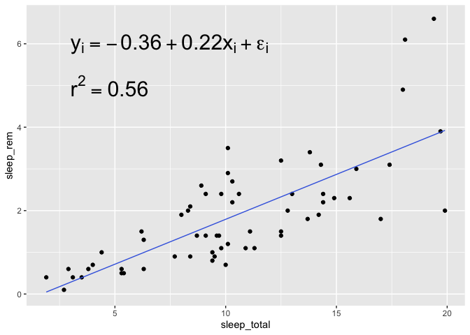
Note that in this case, I modify the horizontal alignment of the geom_text with hjust="left". By default, geom_text is centered around the provided coordinates, but since with need to align
two pieces of information together, it’s much easier to align them to the left.
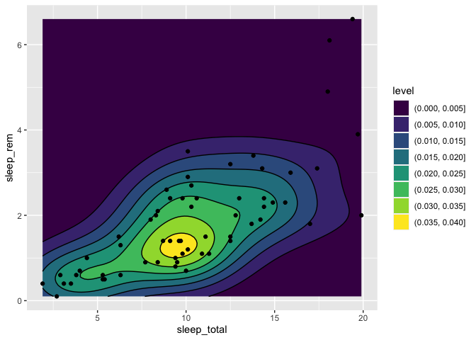
Densities in a 2d space
If you have collected the coordinates of many individuals and wish to produce a density map of these individuals to see if there are any patterns, there is a specially made geom just for that, which is called geom_density_2d.
To illustrate this function, we’ll use sleep_rem and sleep_total as X and Y coordinates, but in a real setting, you’d be using things like latitude/longitude or northing/eating pairs.
msleep %>%
  ggplot(aes(x = sleep_total, y = sleep_rem)) +
  geom_point() +
  geom_density_2d()
Warning: Removed 22 rows containing non-finite values (`stat_density2d()`).
Warning: Removed 22 rows containing missing values (`geom_point()`).
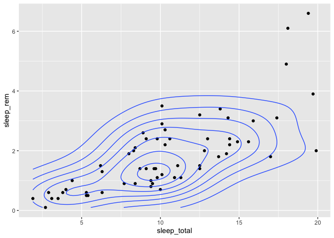
You can also pick a fill color instead of lines (or a combination of both) :
msleep %>%
  ggplot(aes(x = sleep_total, y = sleep_rem)) +
  geom_density_2d_filled() +
  geom_density_2d(color = "black") +
  geom_point()
Warning: Removed 22 rows containing non-finite values
(`stat_density2d_filled()`).
Warning: Removed 22 rows containing non-finite values (`stat_density2d()`).
Warning: Removed 22 rows containing missing values (`geom_point()`).
Customizing
Now let’s leave limnology and ecology behind a bit and see some customizing tips when you’re finalizing a plot before publication.
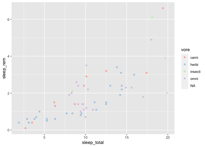
Manually selecting colors on a discrete scale
One common complaint about ggplot2 is that some people feel like the default color scheme doesn’t look very serious or professional.
There are many ways to change a discrete color palette in ggplot2. The first one is simply to pick another palette from a pre-built list. This list come from the RColorBrewer package, and can be found here : https://www.r-graph-gallery.com/38-rcolorbrewers-palettes.html
Let’s see how we could use the Pastel1 palette in a plot :
ggplot(msleep, aes(x = sleep_total, y = sleep_rem)) +
  geom_point(aes(color = vore)) +
  scale_color_brewer(palette = "Pastel1")
Warning: Removed 27 rows containing missing values (`geom_point()`).
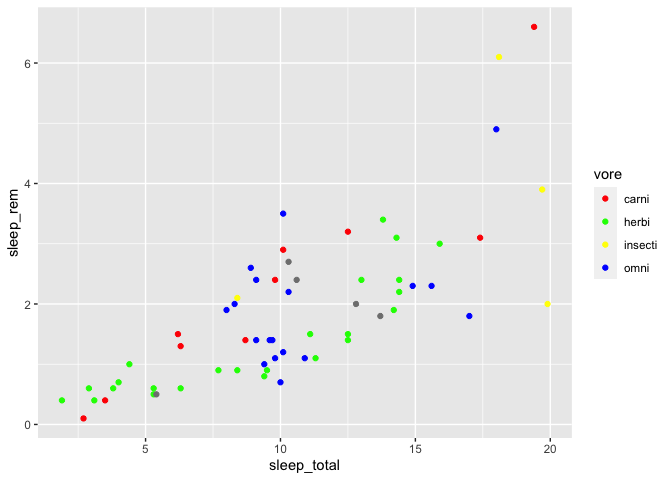
You could also manually specify each color you need. There are two ways to do that. First, by specifying color names :
ggplot(msleep, aes(x = sleep_total, y = sleep_rem)) +
  geom_point(aes(color = vore)) +
  scale_color_manual(values = c(
    "carni" = "red",
    "herbi" = "green",
    "insecti" = "yellow",
    "omni" = "blue"
  ))
Warning: Removed 22 rows containing missing values (`geom_point()`).
Also any color you’ll think about is already predefined (tomato, chartreuse, really anything!). The complete list of defined colors is available here : http://www.stat.columbia.edu/~tzheng/files/Rcolor.pdf
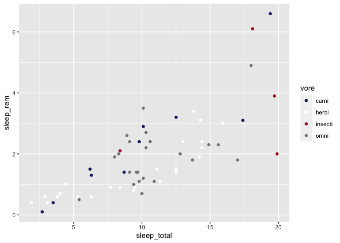
You can also build you own colors with an hex code defining the amount of red, blue and green that your color will have. These hex codes are not really user-friendly to build, but they are one of the ways designers define their colors, and as such, if you are looking for the official colors of a logo, a team, etc., you’ll often find the hex codes on the Web.
For instance, you could easily choose to have a Montreal Canadians (https://teamcolorcodes.com/montreal-canadiens-color-codes/) themed plot :
ggplot(msleep, aes(x = sleep_total, y = sleep_rem)) +
  geom_point(aes(color = vore)) +
  scale_color_manual(values = c(
    "carni" = "#192168", # bleu
    "herbi" = "#ffffff", # blanc
    "insecti" = "#AF1E2D", # rouge
    "omni" = "#888888" # gris?
  ))
Warning: Removed 22 rows containing missing values (`geom_point()`).
Define a color gradient
When the color on your plot is used to illustrate a quantitative value instead of a qualitative one, you can also manually define your color gradient.
First, let’s build a plot using the default color palette :
ggplot(msleep, aes(x = sleep_total, y = sleep_rem)) +
  geom_point(aes(color = brainwt/bodywt))
Warning: Removed 22 rows containing missing values (`geom_point()`).
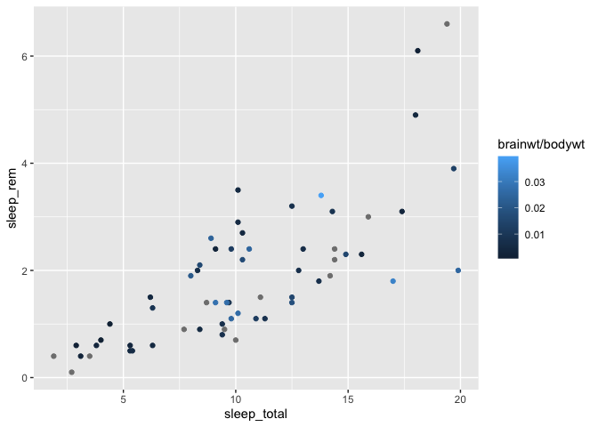
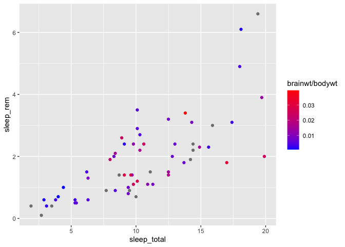
You can then change these colors with the scale_color_gradient function :
ggplot(msleep, aes(x = sleep_total, y = sleep_rem)) +
  geom_point(aes(color = brainwt/bodywt)) +
  scale_color_gradient(low = "blue", high= "red")
Warning: Removed 22 rows containing missing values (`geom_point()`).
If you wish to pick an alternative mid-point color, you can also specify it,
but you need to use the scale_color_gradient2 function instead (i.e. you now define
2 gradients instead of one) :
ggplot(msleep, aes(x = sleep_total, y = sleep_rem)) +
  geom_point(aes(color = brainwt/bodywt)) +
  scale_color_gradient2(low = "blue", high= "red", mid = "white", midpoint = 0.02)
Warning: Removed 22 rows containing missing values (`geom_point()`).
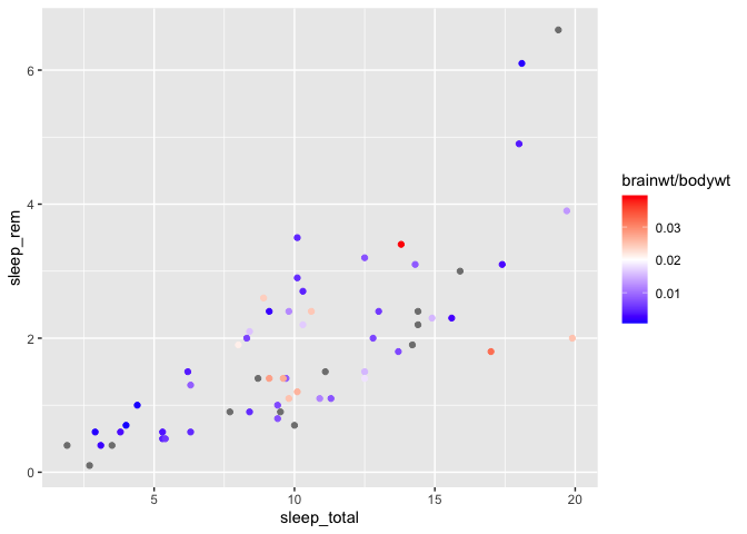
The default mid-point value is defined at 0, but you can change that value manually, as in the above example.
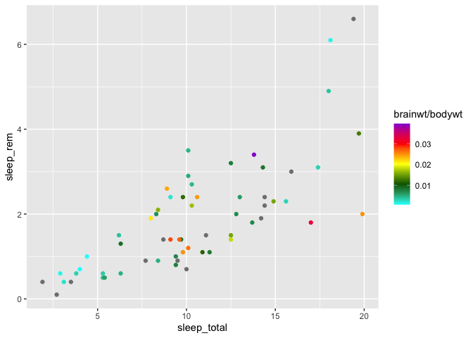
Finally, you can build a gradient with any number of colors, with scale_color_gradientn :
ggplot(msleep, aes(x = sleep_total, y = sleep_rem)) +
  geom_point(aes(color = brainwt/bodywt)) +
  scale_color_gradientn(
    colors = c("cyan","darkgreen","yellow","red","darkviolet")
  )
Warning: Removed 22 rows containing missing values (`geom_point()`).
Note that all the above functions are also available for fill colors. You just need
to replace the color word in the function names with fill, for example with
scale_fill_gradient2.
Also, note that there is also some colorblind friendly palettes that exist. colorBlindness, viridis and colorblinr are good examples of packages exactly for that purpose.
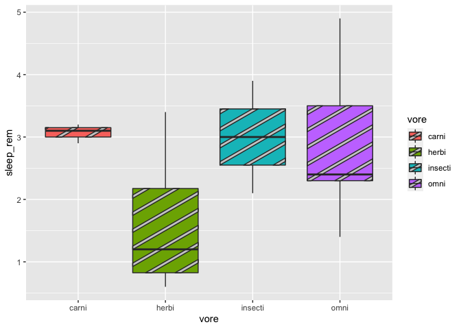
Finally, one might want to add patterns, in addition to colors, for aesthetic reasons or to ease plot interpretations for colorblind people. You can now do it by using the ggpattern package. Here’s an example of a boxplot with stripes. Be aware that, for rapidity reasons, we will simply remove the NAs from the msleep data set. But in a research context, these NAs should be address properly:
msleep2 <- na.omit(msleep)

library(ggpattern)

ggplot(msleep2, aes(x = vore, y = sleep_rem, fill = vore)) +
  geom_boxplot_pattern(stat = "boxplot")
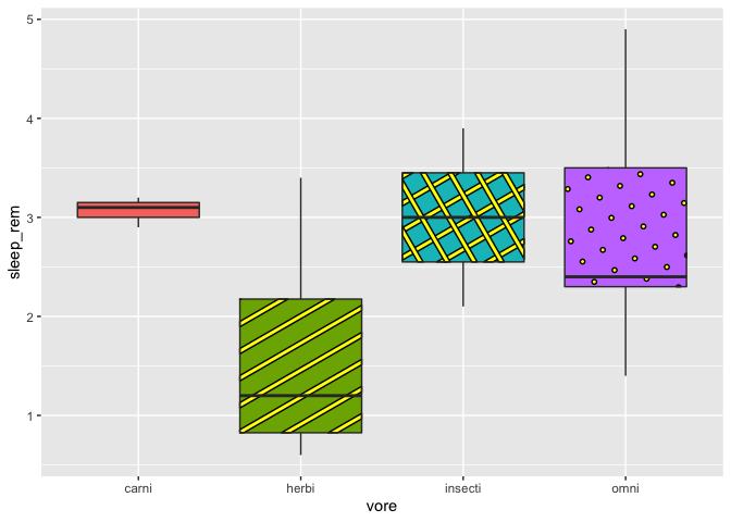
We can also specify the pattern colors:
ggplot(msleep2, aes(x = vore, y = sleep_rem, fill = vore)) +
  geom_boxplot_pattern(stat = "boxplot",
                       pattern_color = "black",
                       pattern_fill = "yellow")

At last, we can change patterns according to our groups. Beware, for some of you, there might be a little issue with geom_pattern_boxplot (ggpattern pretty new package after all). Therefore, we need to specify the patterns values in order to avoid having the same pattern twice in our plot.
#with an issue on the stripe pattern
ggplot(msleep2, aes(x = vore, y = sleep_rem, fill = vore)) +
  geom_boxplot_pattern(stat = "boxplot",
                       pattern_color = "black",
                       pattern_fill = "yellow",
                       aes(pattern = vore))
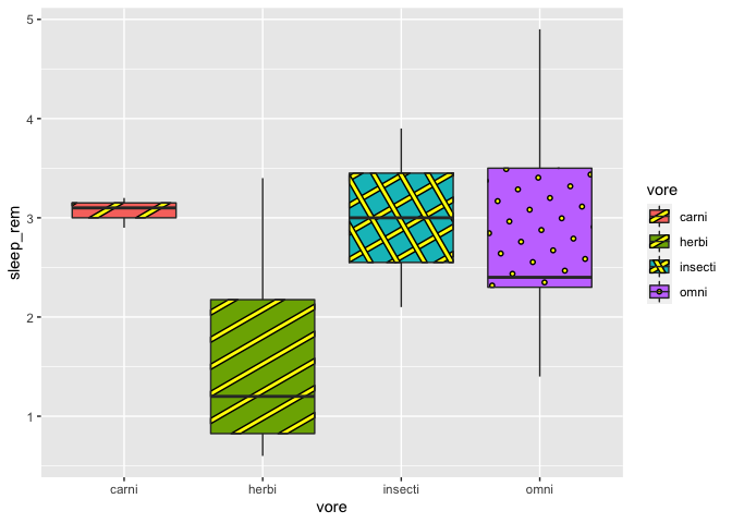
# with the correction to avoid the stripe issue
ggplot(msleep2, aes(x = vore, y = sleep_rem, fill = vore)) +
  geom_boxplot_pattern(stat = "boxplot",
                       pattern = c("none", "stripe","crosshatch","circle"),
                       pattern_color = "black",
                       pattern_fill = "yellow",
                       show.legend = F)
Also, here I had to remove the legend, due to an other issue that makes it kind of useless. But if you use the argument “pattern “ as you would use the argument fill or color in ggplot2, the legend will work just fine. Actually, ggpattern works almost just like ggplot2, except that you can have more fun…just like adding images instead of pattern:
ggplot(msleep2, aes(x = vore, y = sleep_rem, fill = vore)) +
  geom_boxplot_pattern(stat = "boxplot",
                       pattern = "image",
                       pattern_filename =  "https://static.wikia.nocookie.net/orville/images/9/9c/BortusCropped.jpg/revision/latest?cb=20190106062857",
                       pattern_color = "black",
                       pattern_fill = "yellow")
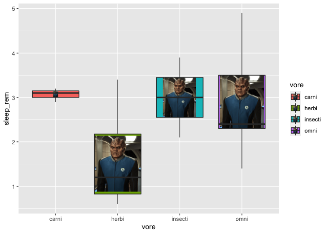
Here, I’ve used an image from the web, but I would advise you to use images saved on your computer, just in case the URL would not work anymore. Thus, that way, you’ll be also able to have a different image for each of your group. Just have fun with this feature!
Editing ANY text on a plot
With ggplot2, any label you see on a plot can be modified, even some that you might not know they exist. The key is to know their name :
ggplot(msleep, aes(x = sleep_total, y = sleep_rem)) +
  geom_point(aes(color = brainwt/bodywt)) +labs(
    title = "Title",
    subtitle = "Subtitle",
    caption = "Source",
    tag = "a)",
    color = "Color",
    x = "X axis",
    y = "Y axis"
  )
Warning: Removed 22 rows containing missing values (`geom_point()`).
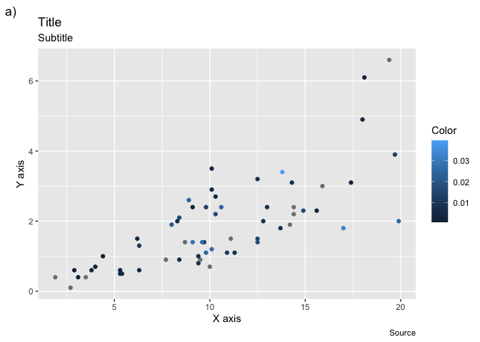
Note that you’ll rarely use title, subtitle and caption, because it is more common to
write these informations directly in the text editor. Also, the label of any
other property you use in an aes call can be edited that way (shape, fill, etc.)
The nuances of the log scale
We’ll now discuss the apparently simple operation of transform an axis to the log scale. The simplest, and most common way to do that is with the scale modifier functions :
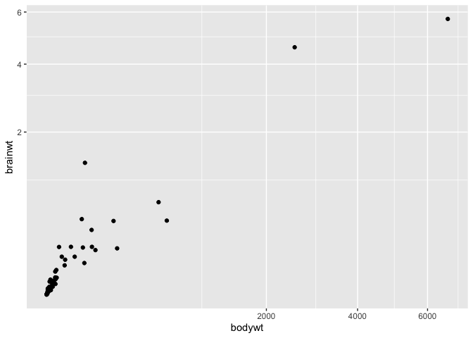
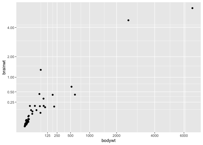
ggplot(msleep, aes(x = bodywt, y = brainwt)) +
  geom_point() +
  scale_y_log10() +
  scale_x_log10()
Warning: Removed 27 rows containing missing values (`geom_point()`).
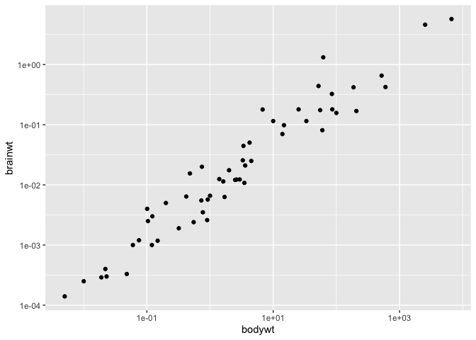
This function directly scales the values, and accordingly, changes the axes and the tick marks on the axes.
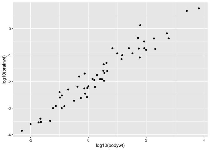
It is a shortcut to transforming your values prior to putting them in the plot :
ggplot(msleep, aes(x = log10(bodywt), y = log10(brainwt))) +
  geom_point()
Warning: Removed 27 rows containing missing values (`geom_point()`).
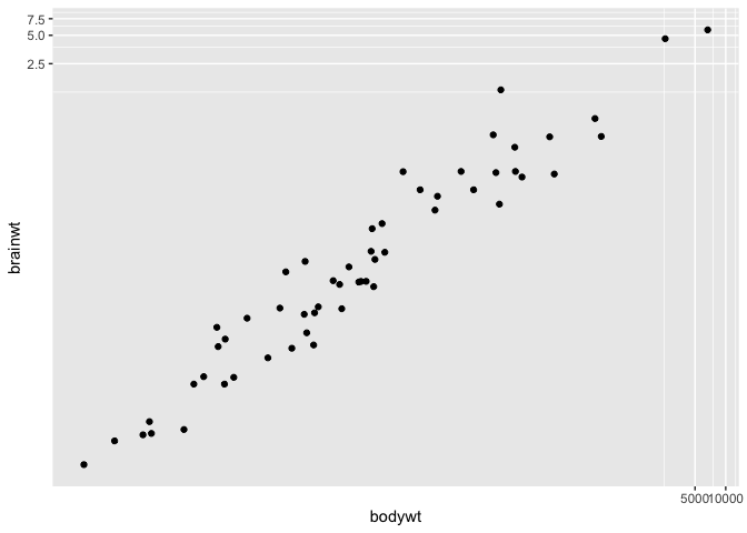
Sometimes though, it might happen that you wish to work at the log scale (e.g. to linearize a relationship) but still wish to have access to the original values for interpretation purposes. For these cases, you can use the coord_trans function :
ggplot(msleep, aes(x = bodywt, y = brainwt)) +
  geom_point() +
  coord_trans(x = "log10", y = "log10")
Warning: Removed 27 rows containing missing values (`geom_point()`).
You can provide this function with any R function, for instance you can use the square root transform instead :
ggplot(msleep, aes(x = bodywt, y = brainwt)) +
  geom_point() +
  coord_trans(x = "sqrt", y = "sqrt")
Warning: Removed 27 rows containing missing values (`geom_point()`).
Modifying tick marks on a axis
While we’re working on the axes, it is also a great time to show you how to
manually choose which values R uses as tick marks on your plot, using the
scale_x_continuous (and y) function :
ggplot(msleep, aes(x = bodywt, y = brainwt)) +
  geom_point() +
  coord_trans(x = "sqrt", y = "sqrt") +
  scale_x_continuous(breaks = c(125,250,500,1000,2000,4000,6000)) +
  scale_y_continuous(breaks = c(0.25,0.5,1,2,4,8))
Warning: Removed 27 rows containing missing values (`geom_point()`).
Publication-ready figures
Combining many plots in a single one.
One of the most common ggplot2 questions I get asked is : how can I combine many plots in a single image. The difficult aspect of this question is that (among other things) this functionality was not built in ggplot2. It comes in external libraries, and many different packages now offers ways to do such things. Moreover, not all of these ways of combining plots allow you to easily save them in a high-res file.
The method I’m showing here is pretty new (2023) and robust to ggsave. To achieve it, you will need the patchwork package.
We first prepare our plots one by one :
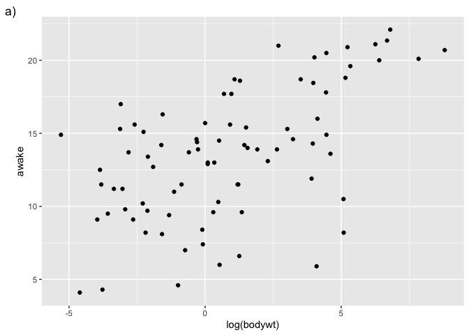
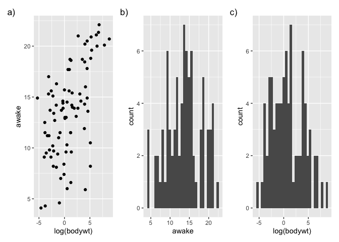
g1 <- ggplot(msleep, aes(x = log(bodywt), y = awake)) + geom_point() +labs(tag = "a)")
g1
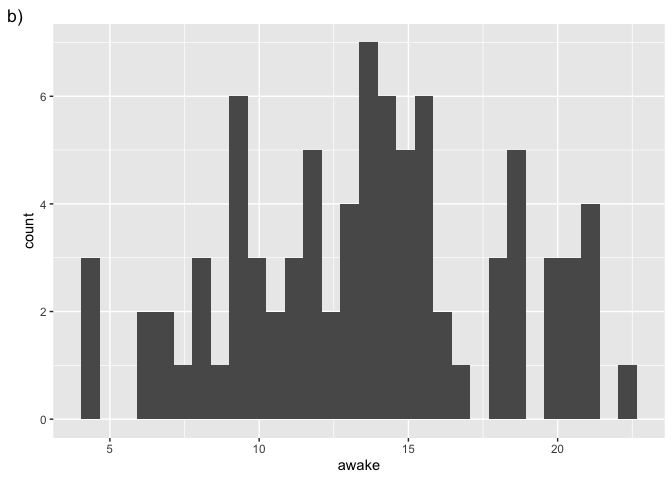
g2 <- ggplot(msleep, aes(x = awake)) + geom_histogram() +labs(tag = "b)")
g2
`stat_bin()` using `bins = 30`. Pick better value with `binwidth`.
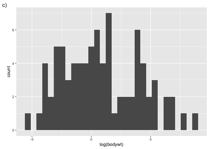
g3 <- ggplot(msleep, aes(x = log(bodywt))) + geom_histogram() +labs(tag = "c)")
g3
`stat_bin()` using `bins = 30`. Pick better value with `binwidth`.
Then we can combine them by using operators (here the +) :
library(patchwork)
Warning: package 'patchwork' was built under R version 4.3.1
p <- g1 + g2 + g3
p
`stat_bin()` using `bins = 30`. Pick better value with `binwidth`.
`stat_bin()` using `bins = 30`. Pick better value with `binwidth`.
ggsave("test.jpg", p, width = 9, height = 4, dpi = 300) # To save a plot
`stat_bin()` using `bins = 30`. Pick better value with `binwidth`.
`stat_bin()` using `bins = 30`. Pick better value with `binwidth`.
Note that, instead of using a function, the patchwork package added a new functionality to the + operator.
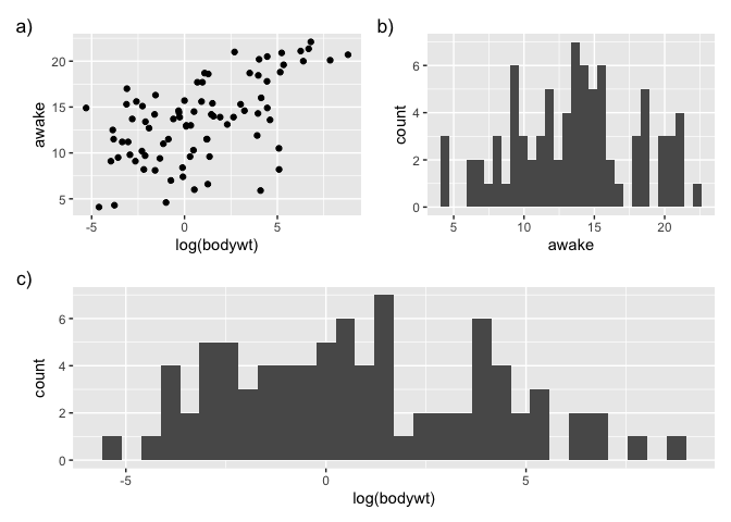
We can also prepare some more complex layouts:
p <- (g1 | g2) / g3
p
`stat_bin()` using `bins = 30`. Pick better value with `binwidth`.
`stat_bin()` using `bins = 30`. Pick better value with `binwidth`.
ggsave("test2.jpg", p, width = 4, height = 4, dpi = 300)
`stat_bin()` using `bins = 30`. Pick better value with `binwidth`.
`stat_bin()` using `bins = 30`. Pick better value with `binwidth`.
By exploring the patchwork package, you will also be able to individually specify the plot’s height and to add a common tittle or legend for your plots.
Sorting the X axis of a boxplot
One thing you might want to do when finalizing a figure is to change the order in which the X axis is presented in a boxplot. By default, ggplot2 presents discrete values in alphabetical order, but this does not necessarily fit your narrative.
Let’s start with a simple boxplot :
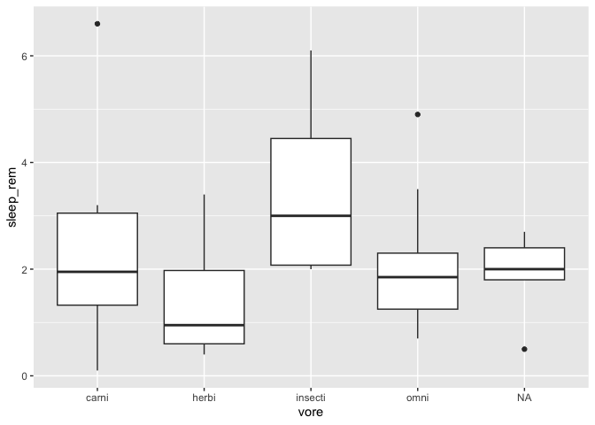
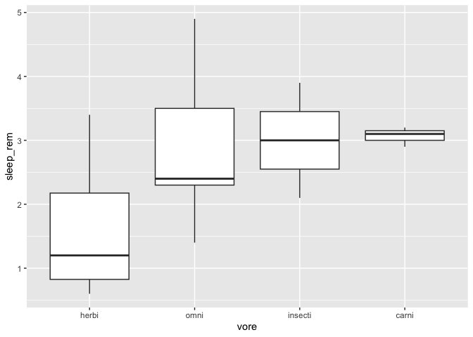
ggplot(msleep, aes(x = vore, y = sleep_rem)) +
  geom_boxplot()
Warning: Removed 22 rows containing non-finite values (`stat_boxplot()`).
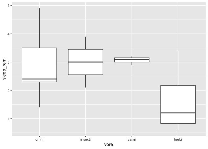
If you wish to sort the X axis in ascending order of their median in the Y axis ( for example if you’re running an ANOVA with a Tukey HSD test), there is a function especially made for that in the forcats package :
library(forcats)
library(tidyr)

msleep %>%
  drop_na() %>%
  mutate(vore = fct_reorder(vore,sleep_rem)) %>%
  ggplot(aes(x = vore, y = sleep_rem)) +
  geom_boxplot()

By default, the function sorts with the median function. You can specify any other R function, for example the mean :
msleep %>%
  drop_na() %>%
  mutate(vore = fct_reorder(vore,sleep_rem,mean)) %>%
  ggplot(aes(x = vore, y = sleep_rem)) +
  geom_boxplot()
You can also manually specify the order, with the fct_relevel function.
msleep %>%
  drop_na() %>%
  mutate(vore = fct_relevel(vore,"omni","insecti")) %>%
  ggplot(aes(x = vore, y = sleep_rem)) +
  geom_boxplot()
Any factor level you don’t specify in the function call are added at the end of the list, in their original order.
Adding little images to a plot
Sometimes, you might want to add little images to a plot, for a more an even nicer looking figure. In order to do this, you’ll need to install and activate an additional package called ggimage, which contains a geom_image function to do exactly this.
library(ggimage)
msleep %>%
  drop_na() %>%
  mutate(vore = fct_relevel(vore,"omni","insecti")) %>%
  ggplot(aes(x = vore, y = sleep_rem)) +
  geom_boxplot() +
  geom_image(size = 0.08, aes(x = "herbi", y = 5.2, image = "https://static.thenounproject.com/png/2545-200.png")) +
  geom_image(size = 0.08,aes(x = "carni", y = 5.2, image = "https://static.thenounproject.com/png/18664-200.png")) +
  geom_image(size = 0.08,aes(x = "omni", y = 5.2, image = "https://static.thenounproject.com/png/5271-200.png")) +
  geom_image(size = 0.08,aes(x = "insecti", y = 5.2, image = "https://static.thenounproject.com/png/2546-200.png"))
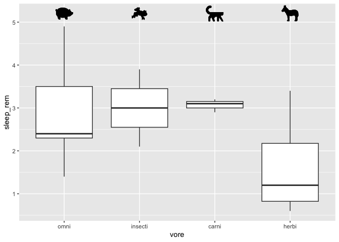
Note that it would be a better idea to download the required images on your computer
and let R use a local path instead (e.g. c:\Windows\etc.).
If you have more than 2 or 3 images, it might be a better idea to store the file paths in a data frame instead of doing it manually like I did.
Also, these little images would have been a good candidate for the annotate function, but as of the publication of this workshop, the geom_image were not usable with the annotate function.
Miscellaenous
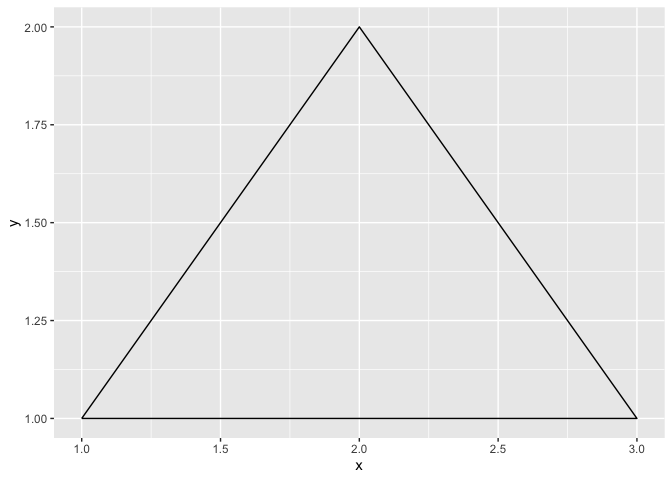
Tracing any shape
If you ever need to draw a shape (really, any shape) in R, you just need to prepare a data frame with the required coordinates, and ask R to connect them with the geom_path function. It is then only a matter of patiently defining the coordinates!
data.frame(
  x = c(1,2,3,1),
  y = c(1,2,1,1)
) %>%
  ggplot(aes(x = x, y = y)) +
  geom_path()
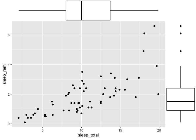
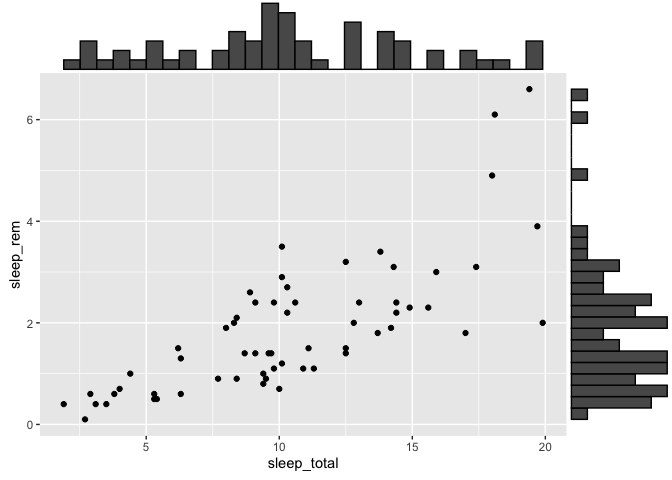
Marginal distributions.
If you ever need to add distributions to the margins of a scatter plot, there is a function built especially for that in the ggExtra package, called ggMargin.
The only quirk of this function is that you must save your ggplot2 to an object before appending the marginal plots. You cannot add them directly.
library(ggExtra)
p <- ggplot(msleep, aes(x = sleep_total, y = sleep_rem)) +
  geom_point()
ggMarginal(p, type = "histogram")
Warning: Removed 22 rows containing missing values (`geom_point()`).
ggMarginal(p, type = "boxplot")
Warning: Removed 22 rows containing missing values (`geom_point()`).